
Within the extensive catalogue of the Spanish publishing group Anaya, we find a range of travel guides for a young audience named “Guia Viva Express”.
In 2017 Anaya touring contacted me to give this collection a facelift. The main objective was captivating an audience increasingly removed from this kind of proposals, while remaining conservative.

I want to touch it!
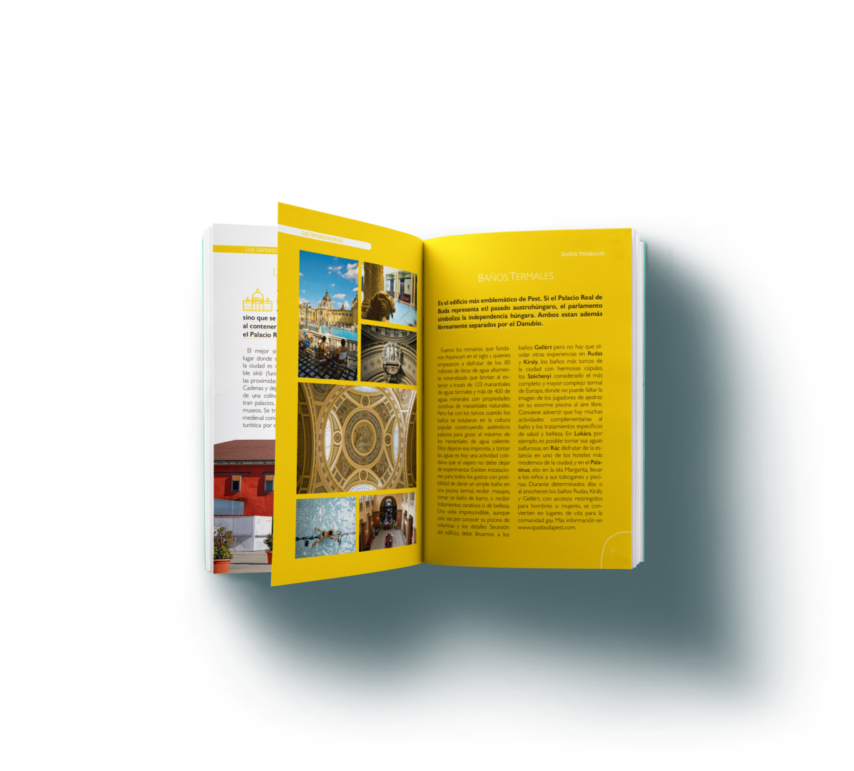
One of the main problems to resolve was a diminishing interest in physical travel guides shown by the target audience. For this, I sought a visual universe inviting to be touched, used and enjoyed. When something in a book catches our attention and we want to have it present and at hand, almost intuitively we turn a corner on the page. That is why the pagination of the guide has a line in which a thumb fits perfectly.
Colour
The guide had a very recognisable vibrant colour palette, but its use was a bit messy.
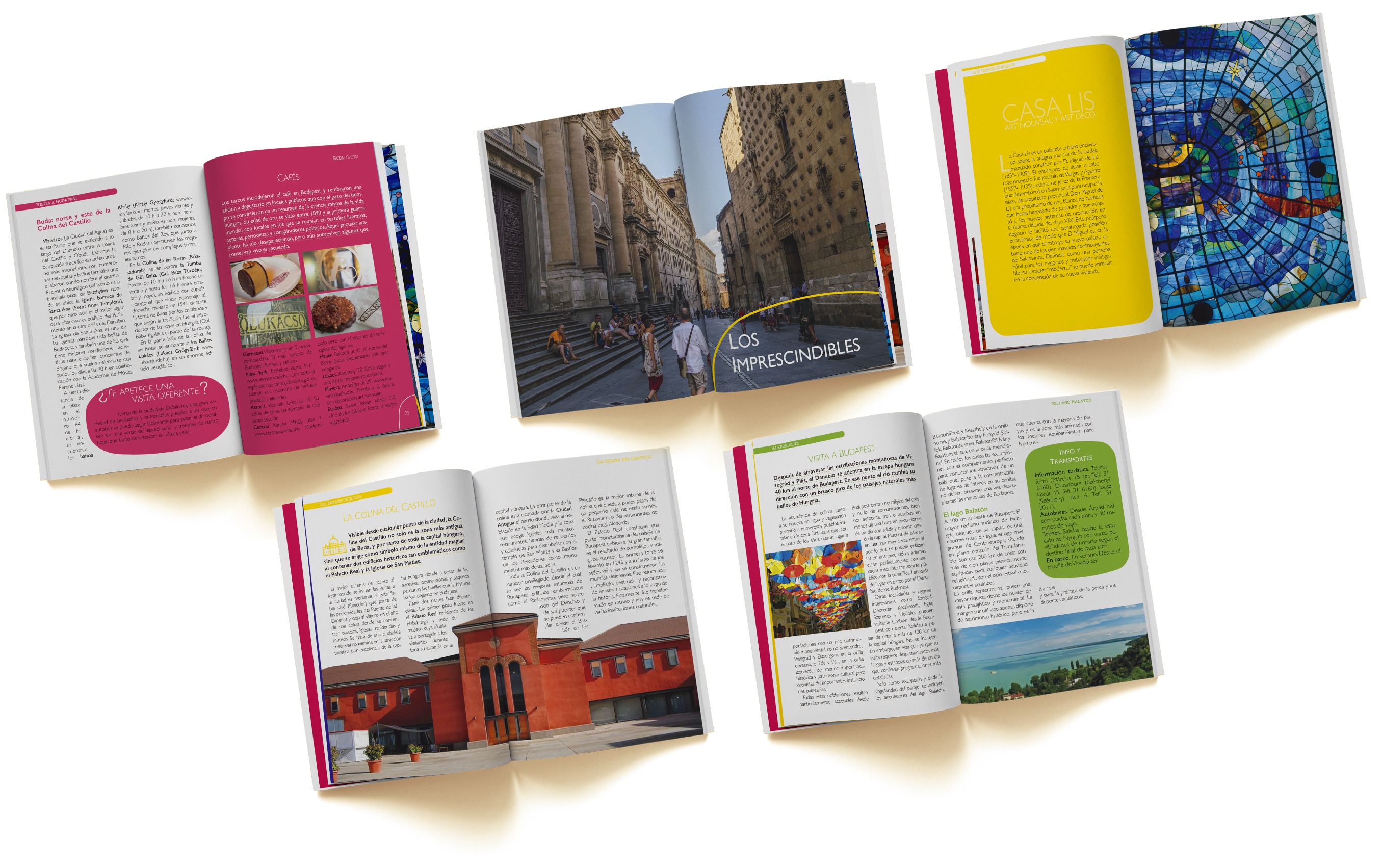
I looked for the most recurring colours, generated a secondary for each one and assigned them to each section of the guide. This way, the navigation gets infinitely faster and more intuitive, as well as becoming more comfortable the more we get used to the guides.
An iconic collection
One of the most dated visuals in the guide was the icon collection.
I removed colours and simplified them. Making the collection more mature yet lovable and recognisable.
This undoubtedly became one of the most distinctive identity resources of the facelift.
A world of possibilities
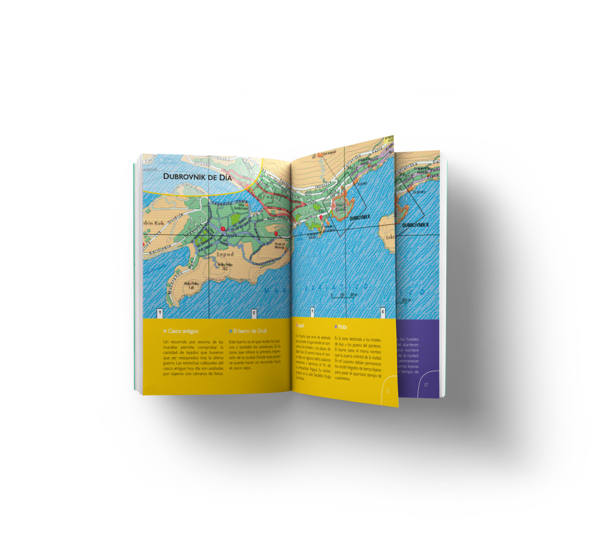
Throughout the guide, very different topics are discussed that require very different layout schemes, which is why I developed a multitude of page models that allow addressing different needs (more or less text, more or fewer pictures, galleries of images accompanied by text…) all of that while maintaining an unmistakable identity.

