moneyfarm logo

One website system for two markets.

Associate Marketing Designer, 2024–2026.

Audit, design system and replatform for the UK and Italian sites.
~200 pages rebuilt as one component system · page builds 20–70% faster · A/B testing capacity doubled.

The brief

Reach first. Then learn what converts.

The campaign promoted Moneyfarm’s trading account (Conto Trading) in Italy through Google App Campaigns, where the platform decides which ad each person sees.

It is a regulated product, so every asset also had to carry the mandatory legal line.
01

Maximise reach

Several distinct concepts for different audiences. Google serves each ad according to people’s browsing signals, so more concepts means more people reached.

02

Test the message

Where we weren’t sure which angle would work best, we ran different messages side by side and iterated on the variables.

03

Improve conversion

A second phase added motion, to find out whether animated assets would convert better than static ones.

01 — Audit

First, map everything.

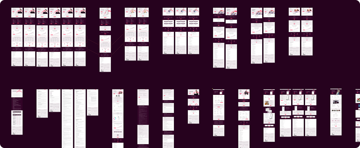
Before designing a single component, I laid out every live page from both sites side by side and grouped what kept repeating: heroes, product cards, rate tables, FAQs, disclaimers.

Most “unique” pages turned out to be the same few sections, rebuilt by hand each time. That board became the brief for the system.

Every live UK page on one board — the starting point for deciding what the system had to cover.

United Kingdom

pages
0
FAQs
0
glossary items
0

Italy

pages
0
FAQs
0
glossary items
0

02 — Design system

A library of stripes.

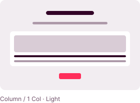
Those patterns became “stripes”: full-width, self-contained sections that stack into any page.

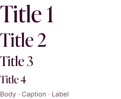
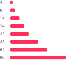
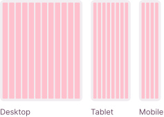
Underneath sit shared foundations. One type scale for desktop, tablet and mobile, a single colour ramp, a spacing scale and a responsive grid. So a page assembled by anyone on the team still looks designed.

Type

Colour

Spacing

Responsive Grid

Strtipes

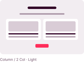
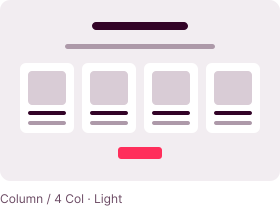
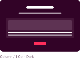
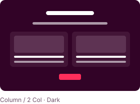
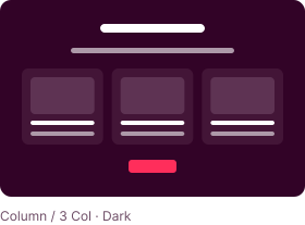
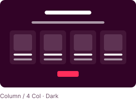
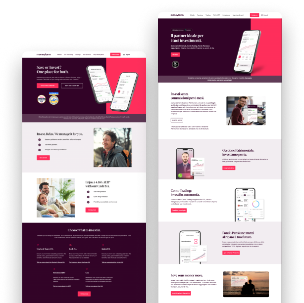
The column stripe, one to four columns, in its light and dark themes. Heroes, text, carousels, product cards and tables follow the same logic.

03 — Replatform

From WordPress to a headless CMS.

The system was designed to outlive the platform. When the site moved from WordPress to Strapi, each stripe became a structured content block.

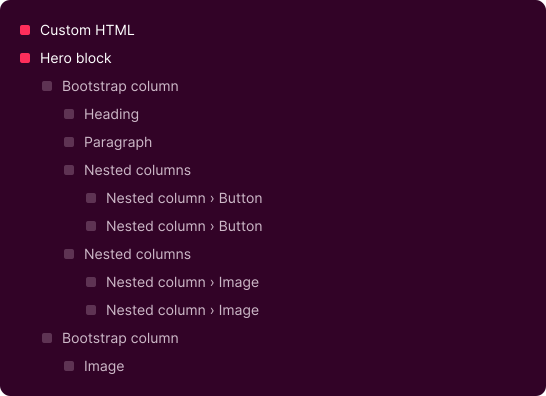
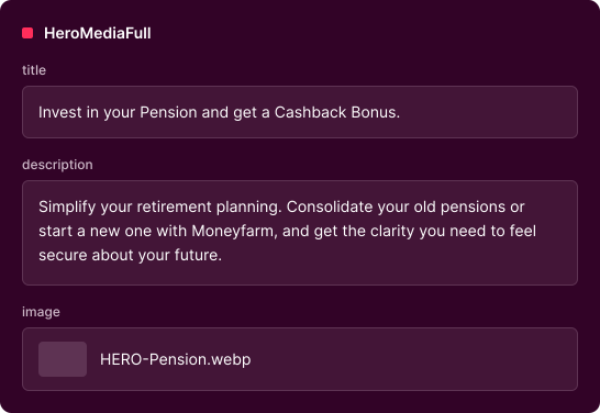
Marketers now fill in a few fields instead of nesting blocks and custom HTML… and the layout can’t drift.

Before · WordPress

One hero: a tree of nested blocks, plus custom HTML to hold it together.

After · Strapi

The same hero: one block, three fields.

  1. Jun 2024Design analysis kicks off
  2. Sep 2024Design system kicks off
  3. Mar 2025Migration kicks off
  4. Jun 2025New Italian site live
  5. Sep 2025New UK site live

Italy went first: six and a half weeks to build and around six to review. For the UK we planned and trained up front. Six weeks to build, three to review.

Results

What changed

20 - 70%

faster page builds, depending on the page

2 x

A/B testing capacity on the website

~200

pages across two markets, now on one component system

6 → 3 weeks

review and polish time, from the Italian launch to the UK one. The second migration was planned and trained for up front.

Next Case Study

Performance creative, built to scale

Google App Campaign for Italy: seven concepts, three sizes, two experiments.