Plande is a Spanish business group in the telecommunications sector with a commitment to the people, companies and environment. At the beginning of 2021, they contacted me to create their online identity.

Creating visual IDENTIty
Under the umbrella of the matrix group, there are 3 different companies, each with its own objectives, so to show it, with a unique identity.
All of them are united by a common ecological spirit, that is why we decided to choose 3 types of different natural environments to represent each one.
When I started working, each brand had an identifying logo but there was no visual universes developed. This gave me the freedom to explore different alternatives and create several unique yet connected aesthetics.

PlanD
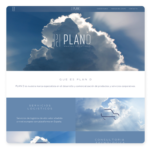
The Plan D logo is based on an ad-hoc, very stylised sans serif typeface. Being that stylisation even more accentuated in the D.
On the left side, there is an icon formed by slender lines that make up a P and a D, this was what gave rise to the aesthetics of the other resources such as icons.
The fact that PlanD, in addition to being one of the 3 brands that form the group is the one that gives its name, positions it above the others… like heaven.
So with that, we had a defined theme, color and line.
These are the icons that illustrate each action pillar:
Logistic
SERVICES
technology consulting
customer
support
management services
custom
services
Supplia
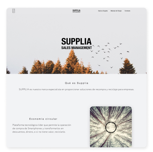
The Supplia logo is built in Helvetica, probably the most widespread typeface in the world, supporting thousands of businesses and communications.
Supplia’s action pillars are more focused on recycling and the communication between the different actors of a large value chain. That is why the “vital” sustenance and the intercommunication of multiple parts that make up a whole, in Supplia’s aesthetics, appears represented by forests.

These are the icons that illustrate each action pillar:
Circular
Economy
Value Chain
B2B
Recycling
for SMEs
Certified
Recycling

Zwapa
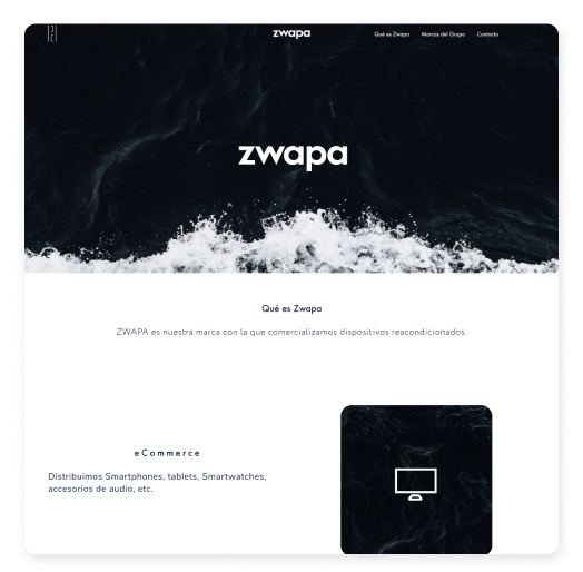
The Zwapa logo is built in lower case Futura. Futura is a very geometric, clean and friendly typeface that results very easy to read.
The main focus of Zwapa is the commercialisation of refurbished devices with all the guarantees.
In a current interconnected environment, commerce crosses seas and oceans, which is why that intensity is what surrounds the clean and powerful visual universe of Zwapa.
These are the icons that illustrate each action pillar:
eCommerce
Market Places
Guaranteed Stock
Price
Warranty
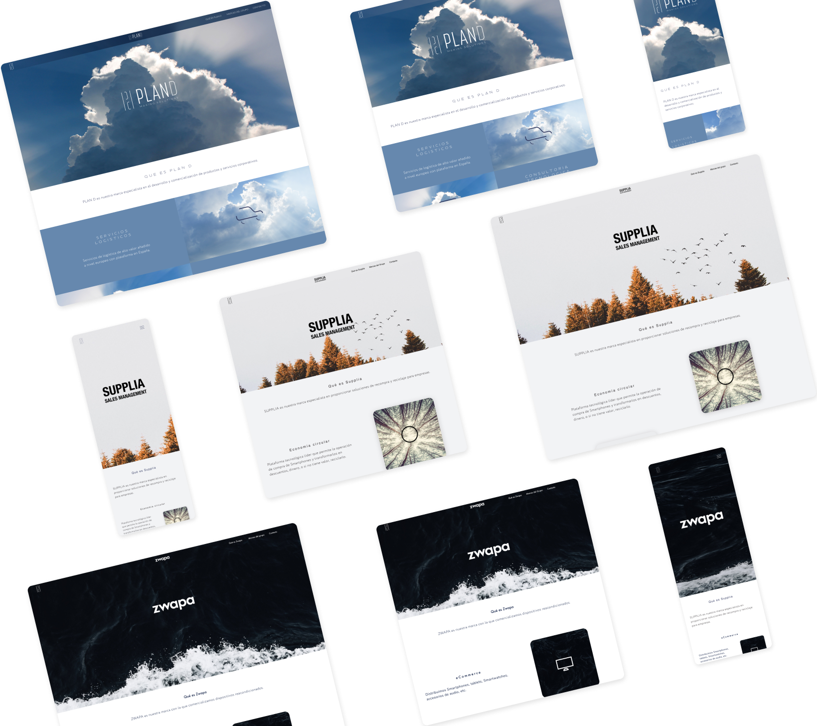
responsive
In Plan D they work mainly with mobile devices, which is why at all times throughout the web design and development, adaptability to different screen sizes was present.

