ReyMago.com logo white

During the 2020 pandemic, El Rey Mago decided to reinvent itself and to do so, start selling online as well. Such leap needed a new look more in line with the digital language.

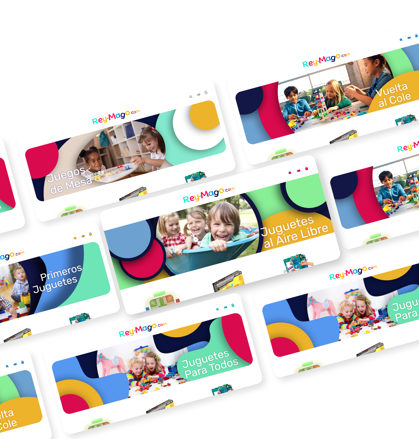
Rey Mago section banners

The Challenge

Throughout its more than 30 years of existence, El Rey Mago has managed to be very recognisable among its clients, so the redesign, while disruptive to adapt to new media, also has to pay tribute to the past of the brand.

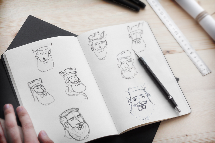
Rey Mago sketches
El Rey Mago original logo

Previous design

Seeking the mascot

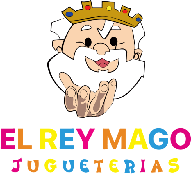
The expression of the Rey Mago has always been affable, close and fun, that is why it was very important to start with a mascot that conveyed all those emotions. At the time of creating it, playing has been present as children would have, going out of the margins and using irregular yet fun shapes.

Rey Mago crown detail
Rey Mago happy face
Rey Mago text condensed color

The name

This is a toys selling company, it is impossible to resist playing a little even writing its own name.

The typography was created ad-hoc for this logo, looking for a clean result so it works well in digital environments while being friendly, affectionate and of course, thanks to endings at different angles and some inclined letter, really playful.

Colour

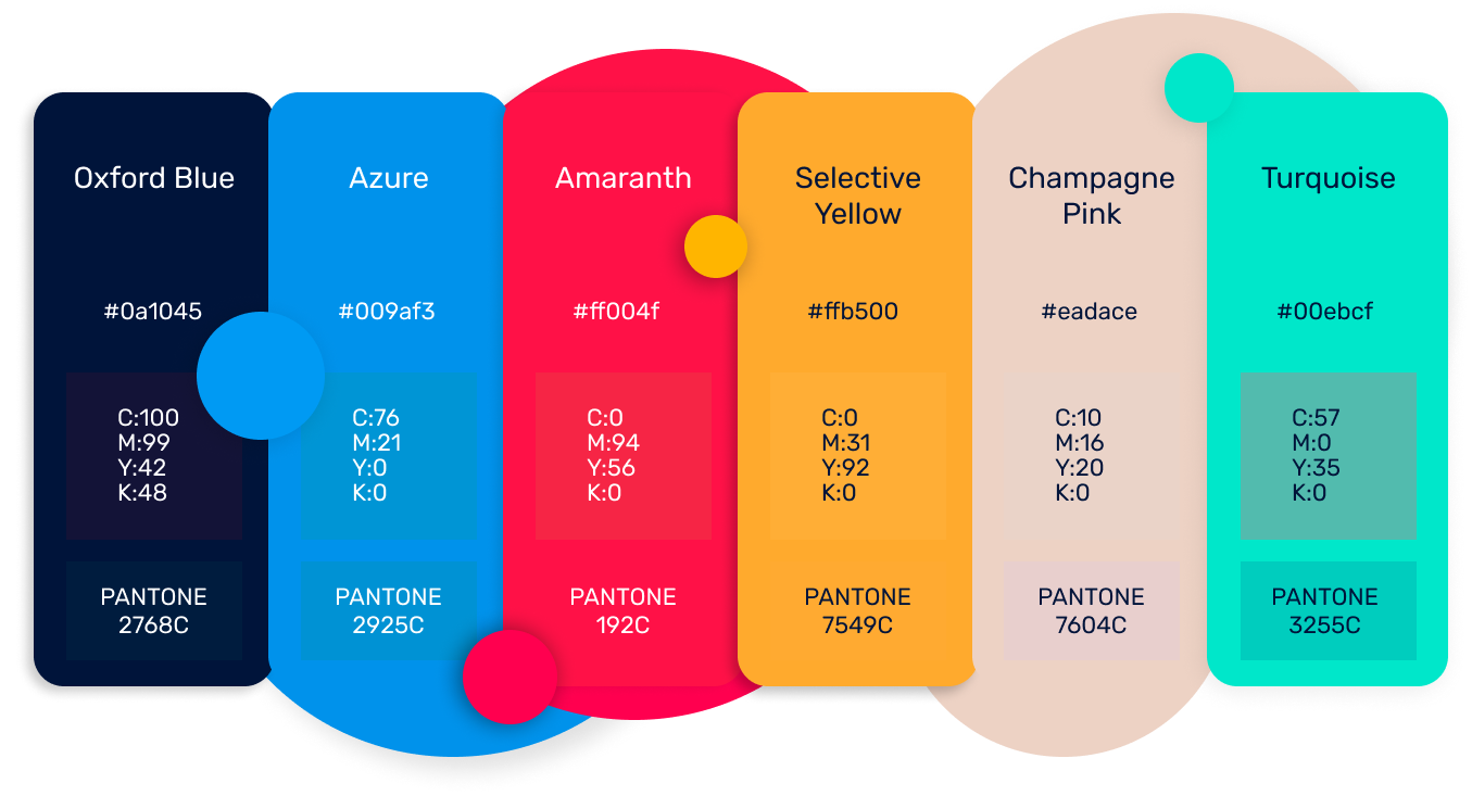
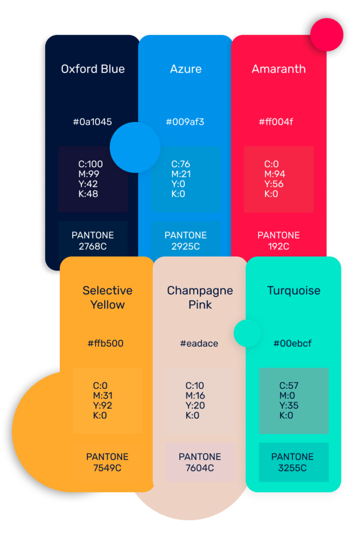
The universe of El Rey Mago is joy, colours, good times and better memories. Many positive and intense feelings that have to be visible in the brand. For this, I have developed a palette of 7 vibrant colours that draw from the brand’s past adding a modern approach.

Rey Mago full logo color
Rey Mago color palette
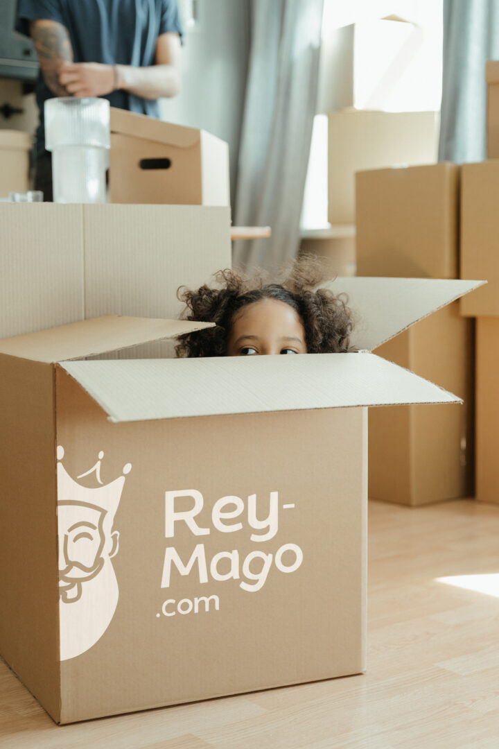
Rey Mago box

The re-branding today

Unfortunately, the costs derived from a cross-platform brand update made the company’s management decide to limit the changes to the digital environment.

Digital world​

Web multicolor navigation Icons

Along with the brand design, I explored different resources such as navigation icons adaptable to the different corporate colours, as well as an animated version of the mascot.

To illustrate each of the different sections of the web, I designed a series of banners inspired by the shapes that make up the logo.

Each banner has its own identity while being consistent with the whole.

 Visit the store: